Showing posts with label pink. Show all posts

Tuesday, July 13, 2010

Essie The Summer Collection 2010 Review

Hey everyone! Sorry I have not been posting photos of polishes in a while but it's summer meaning the following: I am on vacation a lot and I am being more relaxed (which is a nicer version of saying lazy.) So to make up for that at least partly, here is the Essie summer collection--fully swatched and ready to go! Hope you all enjoy and remember to run on down to the comments and tell me your faves :)

Plus ignore my gross cuticles, another reason I haven't been swatching much lately but I bit the bullet for you guys!! <3>

First off here is Demure Vixen, a medium putty-mauve with teeny-tiny particles of red and bright purple microshimmer. The little shimmer in it is what sets this apart but you have to look close for it--hence the shade's name! I put a closeup down below so you can see that shimmer and in my opinion, this is what gives this color the WOW factor. Without that, it's just another mauve. This was a three-coater.


...and the closeup! LOVE!

Next up is this gorgeously pink-toned coral, Haute as Hello! My swatches truly do not do this color justice because in real life it is much less pastel and way more of a "WHA-BAM! In your face!" type of shade. I personally love this one to death, I think it looks great with my skin tone and it would with so many other peoples as well! I got several compliments for the 3 days I sported this guy, one of which was "I think this may have to be one of my favorites on you!" If you are worried about finding a dupe, remember, this one has that fun summer brightness that packs a punch while still far off from neon territory. My style all the way, this is a winner. This was a three coater.


Here is
Miss Matched. I can't say I really get the name of this one. Maybe because a sheer would match with everything? I'm not sure. Anyway, this milky white with a touch or pink sheer is not my style and really not summery. This one also was very watery and gave me some serious cuticle drag. I adore Essie's other sheers way more than this one. This was a three coater.

Following that is my stunning red-orange creme, Vermillionaire! I have already worn this color two times because to me, it is just the perfect summer "whenever" shade meaning it's festive enough for a nice dinner out but flattering enough that you can use it daily. This was a surprise because I thought it was going to be just a plain red... again. I am pleasantly surprised with this deep orange gem which is bright but not neon, like Haute as Hello. This was a three coater.


Right up next is
Knockout Pout, an amped-up bubblegum pink with a jelly-ish texture. I am loving the name of this one, it's so cute!! My swatches look a bit pale for this shade, it's more bright and has more depth than the picture is showing, grr. Anyway, I like this a whole lot more than I was expecting and out of the bottle it looks much better! This would flatter any skin tone and is a cute summer shade. Not groundbreaking, but good looking nontheless! This was a three coater.


Lastly is the stunning shocker of this set, the green (yes you heard that right ESSIE GREEN)
Pretty Edgy!! Oh my gosh I can barely believe what I am seeing. Let me recap for you in case you blacked out there for a sec. This is a gorgeous medium grassy green creme (in an Essie bottle OMG!) that's the perfect tone for summer...and for the rest of the year for me! This is not the type of green that can be confused for black, which I love. It's natural looking and fresh and best of all, anyone can, and will, notice! This is going to be a hit, I can smell it. A "must-have-to-buy-now" for any polish fanatic! LOVE IT! This was a two coater.

Overall, this collection knocked my socks off color wise and formula wise as well. Each of my shades were buttery smooth with the exception of Miss Matched, as I explained earlier. My one final problem was that the brushes are still a bit small for my liking, but nothing that will prevent me from wearing the shades, just an... annoyance you could say.

Essie, if you keep throwing collections out like this, you are really pushing the boundaries the right way--delivering unique colors that are still wearable for a big range of people and are flattering on the nail. All in all, I will be sporting the majority of these shades on my tips way more than once and these are the types of colors that I'll want to whip out, even when the season ends. I highly recommend that anyone who remotely likes nail polish to go and check these out ASAP. These collections are the types that truly turned me into a self-proclaimed nail polish fanatic; I like to really flip when I see the colors come to life on my nails! Thank you, Essie, for a beyond fabulous season!! <3

So, do you all agree? Voice your opinions down in the comments!
Till next time, xoxo.

Tuesday, May 4, 2010

Essie Wedding Collection

Hey everyone! Watch my video review on the Essie wedding collection to get a peek of all of the colors and know what I think about 'em! Enjoy!

Monday, April 19, 2010

Zoya Flash Collection

Hi everyone! I'm here and excited to show you the Zoya Flash Collection, the other half (with sparkle) of Zoya's Summer 2010 showing.

Robyn. This bright turquoise creme is definitely a summer shade! It's a standout color and a gorgeous one too. I like this shade because it's bright but not too bright (I don't know about you but I am a bit tired of neons.) Oh, and did I mention that this shade looks good any skin tone?! If you are looking for a fun color that's still flattering, Robyn's your gal!

Perrie. This soft lavender creme is nothing short of stunning. This color is light yet saturated enough to pop on anyone's skin. It kind of reminds me of a shade of the typical "perfect" flower--so pretty!! Lot's of lavenders exist in the world of polish but something about this one, possibly the undertone, just makes it stand out in a huge way. If you even remotely like purples, you need this baby!!


Dana. A bright, cool-toned berry creme, Dana is also ranked high on the flattering scale. It's not totally unique but not even close to ugly! I will definitely be wearing this one, as well as Robyn and Perrie. To better describe this shade, it's either a super-saturated watermelon or a slightly pinker raspberry. This would also make for a standout pedicure!


Jolene. This slightly-brighter-than-bubblegum-pink creme is a fun color and waayy cute! I didn't care for the appearance as much on myself as I would on another skin tone, but I actually ended up loving it on me! When you see this color, the first thing that probably comes to mind is candy, or for me, those colorful stripes on beach umbrellas! Just summer all around!

Maura. A bright tomato creme, and totally fabulous! I love this type of shade in particular on my toes and in all fairness, if this isn't a summer color, honey, I don't know what is! This shade would look stellar on anyone, in my humble opinion.


Jancyn. This soft tangerine creme has a bit of brightness to it--a tangerine scream!! Haha get it, tangerine creme, tangerine scream, hah hah. It, well, rhymes.... *cue crickets* Back to reality, this is an alright color. Orange cremes and I don't get along too well, they just don't look good on me, that's all! This is an okay shade on it's own but it leans dangerously close to mac 'n cheese territory. Although, this is an easy to like color if you have the skin tone to pull it off.

To hear more what I think of this collection, please watch my video above! Thanks!

Tuesday, April 13, 2010

Zoya Sparkle Collection

Hello everybody and today I am here to show you all the fabulous Zoya Sparkle collection for summer 2010. It is one in a two-part collection (Flash and Sparkle) so Flash will be coming up soon. I did a short, short video which gives a more accurate depiction of the colors but I still wrote a normal extensive review. You can watch it if you like right here below. Enjoy!
PLUS, CHARLA IS THE ONLY COLOR I SWATCHED BECAUSE THEY ARE ALL SO HARD TO CAPTURE ON MY CAMERA, THIS WAS THE ONLY ONE THAT WAS EVEN REMOTELY ACCURATE.


Now the normal review:

Ivanka. This sparkling glass fleck is chock full of gorgeous multi-dimensional "flakie" shimmer, as is every color in the collection. I'd describe this shade as a light-ish emerald green with hints of deep blue, although that doesn't show up on the nail--just the green. This color is so amazingly pretty and very wearable for a green I'd say. I'm glad that the super dark greens have begun to fade out of season, I love it when people can actually tell I'm wearing green and not black!

Charla. When I see this color, one word comes to mind. MERMAID!! Isn't it though? A mermaid blue sparkling glass fleck that slightly resembles that absolute perfect tropical ocean you see on a photoshopped postcard. Aaahh, I can feel the sand in my toes already. Back to what I was saying, I love this color too! The mixture of shades within the bottle of polish is simply mind boggling and you would have to see it in person. Outstanding!

Mimi. This shade is a deep royal purple sparkling glass fleck and boy, is this a rich shade or what!? The flaky shimmer in it is a somewhat light purple and that just gives the "grape-syrupy" colored polish all the more depth. Don't get grossed out by that description, if you did I apologize, but this is a fantastic color!! It's so unique too and a color for all you purple lovers to definitely go gaga for!

Alegra. A rich fuchsia candy-like sparkling glass fleck like this just completes this collection, in my opinion. Even if you are tired of berry like shades, the sparkles and flakes definitely re-vamp the trend. Oh, wait, did I see a few silver flakies in there too? Yes, yes, this polish is full of fun little pieces that you normally wouldn't think to find in a pink. A unique pink!! Thank you Zoya.

Nidhi. This tomato paste red with minimal silver flakies has me scratching my head a bit. It does not seem to me to fit in with the rest of this collection's "chock-full-o-sparkles-and-depth" bio. The sparkles in this one seem to be hiding, or like somebody just sprinkled some on top instead of mixing them in at full throttle. Anyway, not my taste but I just feel like something is missing.

Gilda. This sassy hot pink sparkling glass fleck is super summery! I love the fact that Zoya put a new spin on a classic neon hue. I really like this color as well and this is a type of polish perfect for a fun party or a day at the beach! The hue almost reminds me of a super-bright tropical flower... ahh the thought won't escape my mind, summertime vacation :)

Onto formula, all of these were 3 coaters except for Nidhi, which was 2 coats. Signature Zoya application, FLAW-LESS *said in a sing-songy voice*! Anyway, the type of simmer in these polishes really impressed me both by it's unique feel and combination of glass flecked shimmer and metallic shine. Color me a HUGE fan! Zoya has been knocking it out of the park for the past few seasons, and with a huge smash at that!


Flash Collection will be reviewed soon!

Sunday, April 11, 2010

China Glaze Up, Up, and Away (3 colors)

Hello all! Today I have some super-cute polishes to show you from China Glaze's Up, Up, and Away collection! I really liked these colors, they are my fave 3 from the whole bunch, so here they are, without further ado. (Formula and other ramblings after)


Something Sweet. I wore this delicate mod baby pink in my "Day at the Beach" post recently. It's a stunning pink and very flattering too. It gives your nails that "perfect" look especially from afar without the time and hassle of doing a french mani. I love this little one!

Lemon Fizz. The name fits this shade of polish PERFECTLY! It's a pale lemon yellow color, like the typical pale yellow that one orients with Spring. I was very surprised at how bright this color was once it's on the nail! A bit more so than in the bottle!

Grape Pop. This blue purple creme is very much like the color of grape soda. I'm surprised that this was released in a spring collection, it looks a bit more summer/fall like to me but it does balance out the other pale cremes nicely, I'll admit!!

Onto formula... All of the polishes were two coats except for Lemon Fizz, which was three. There were no formula troubles on any except for Grape Pop. Okay, if you can't already tell from the swatch above, I had some major issues. It was super thick and runny and I had some serious pooling of polish at my cuticles. Major frown. For the most part though, all top notch!!

These colors are already available. What were your faves from the collection??

Tuesday, April 6, 2010

Essie Resort 2010 Collection

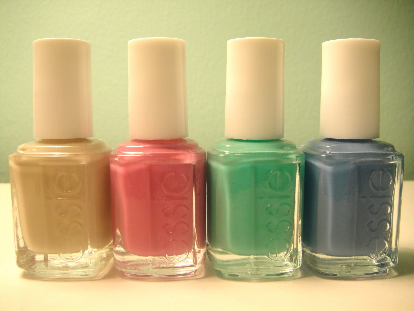
Hello everyone! Today I have some swatches for you all of the Essie Resort for Summer 2010 collection. It's full of four gorgeous cremes that totally scream out "summer here we come!" if you ask me. Now, to the pics! We'll talk formula after.


Turqoise and Caicos. The star of the collection in my book. This beautiful seafoam green creme has a slightly sheer and jelly like consistency. My swatch is three smooth coats. I love colors like this! It's kind of like Essie Greenport and China Glaze For Audrey but a greener, less creamy version. Simply stunning and very unique! This resembles like the typical "perfect tropical waters" color, which makes me go all googly-eyed. I cannot think of a single thing that I even remotely dislike about this color. It is a work of fabulous genius! :) BTW, sorry for the slightly funky looking swatch, this was so hard to capture accurately on camera!

Lapis of Luxury. This cornflower blue creme has a similar texture and consistency to Turquoise and Caicos. I absolutely adore this color too, actually it's my current pedi! Anyway, this color is absolutely fab and a very unique blue I might add. Wow, this collection even already is taking me over by storm, I love it!

Playa Del Platinum. This muted sandy creme is not very fitting with the rest of the colors we see in the collection. However, it does balance the fabulous colorful polishes out, and in a very good way at that! This color is a nice alternative to the traditional sheer pink or muted pale gray and it looks surprisingly lovely on nails. Color me amazed!
Splash of Grenadine. This light berry magenta creme is lovely indeed for a summer collection! This color is a bright-ish shade but not very overwhelming, which is a nice change from all of the blazing neons we have been seeing lately. A very pretty polish and I think that this will flatter any type of skin tone equally nicely!

These shades are extremely wearable as well and for the most part, I loved 'em! I have been wearing Turquoise and Caicos on my nails for about 4 days and I got tons of compliments, whether from my friends or random sales clerks when I went shopping! Anyway, needless to say that one was my favorite but closely followed by... well that's too hard to choose right now, I like 'em all! The formula on these was semi-sheer but fabulous. Super smooth and easy to apply, perfection in 3 coats. I like what Essie has been doing lately in terms of collections. The Spring collection was gorgeous and last summer's, and the north fork were no exception. Essie, I love your pinks and other signature colors, but when you go for fun shades like this, there's no way you'll get it wrong!! Bravo, resort collection, you are here to stay.

What do you all think of these colors? (They will be released in late April/early May)

Saturday, April 3, 2010

Color Club Rebel Debutante Collection

Here is the Color Club Spring 2010 Collection- Rebel Debutante. I can't really pinpoint any common theme throughout this collection except that they are all cremes of some sort. Sorry that my swatches are not the best right now, my current rainy weather forbids me to swatch outside! So sad... Please please cope with me though, this is the last of bad indoor swatches, I will be fixing my indoor situation soon *cue "yayyy" sound effects!* To the swatches! Colors first, formula after.


Uptown Girl: Muted purple creme. A bit more purple then my swatch shows, sorry!! This is very reminiscent of OPI's Parlez Vous OPI? from a few season back. A pretty shade, but not so...
unique if you know what I mean. Pretty and wearable but not fresh or exciting really.

Best Dressed List: I surprisingly like this sandy medium tan creme on me, although I hate most colors of this type! It must have different undertones but I can't quite put a finger on what they are. Anyway, this is a nice neutral shade for Spring, perfect for paring with a floral dress or a fun super-accessorized outfit.

Gossip Column: This shade is a dark teal blue that looks a touch lighter in person. It reminds me of China Glaze Shower Together from AGES ago! Remember that one? Very similar but I'm afraid better than this version. Back to the post, this is not an ugly color, but not unique or pretty enough for me to go drooling all over myself. Just a "meh" color.


Charity Ball: Okay, this color is not true to life AT ALL here. It's much less of a diseased poop shade and more of a deep burgundy chocolate. I just had to throw that out there. Anyway, even in real life it's kind of a "huh" color. Dark browns in spring, you said what?? Yea, and it's not the most flattering of all colors either. Sorry, not a winner.
She's Soooo Glam: A mod-like easter egg pink, only vamped up a notch in brightness! This sure is one blazing polish, girl! Super bright on nails, although it doesn't look it in the bottle. A unique snowflake for a pink polish, and I like it!
Ms. Socialite- I like this one. It doesn't look totally stellar in the bottle but on nails it just brightens up and comes to life, baby! Super pretty and totally fitting for Spring's bright and fun vibe. A keeper for sure!!
Rebel Debutante: The namesake color of the collection. A very soft and sweet spring green creme, yet extremely neon at the same time! This one is a very unique color but I am not so sure I am in love with the color... not yet anyways. What do you all think of it? I either love it or really hate it, I can't decide. Weird, but true!

Okay just realized I forgot to swatch two colors! Aaaahh, my fault, so sorry! They will be up in the next Polish of the Day post, so don't fret!!

On formula. Okay, I am assuming that I got a bad batch because mine were very thick, but also really like to pool at my cuticles. Not cool or fun for me, just a pain. These were all three coaters, or else they were not even or opaque completely. The formula kind of ended up making me a little mad during swatching, it was so hard to get on even remotely normal looking for most of 'em! All I can assume is that I got a bad bunch. And a heads up, I experienced some extreme chipping on these, after 1 day of wear! (see first swatch)

Anyways, there are a few colors worth picking up, but I'm not sure if it's really worth all that much fuss.

Thursday, April 1, 2010

Essie Resort Collection 2010 Preview

I was soo excited when I pulled these out of my box of shiny and new essies!! The resort 2010 collection is now here! The above photo is me pulling them out of the box, and aren't they stunning?! Bottle pics below.


In case you can't read the names (from left) Playa Del Platinum, Splash of Grenadine, Turquoise and Caicos, Lapis of Luxury. So pretty! These are all cremes for the record. Swatches soon!!

Tuesday, March 23, 2010

Polish Of the Day 3/23/10

Here's a new little segment on Polish our Planet, called polish of the day. It allows me to take a break from collection swatching and show you guys some of the colors in my stash that I really like!! Enjoy!

Okay, so my polish of the day is Essie Beach Party. I am not sure if this is discontinued or not but I think you can still find it on the Essie website. Anyway, about the polish! This is a gorgeous pastel pink/peach creme. It is very stark and opaque in three coats, plus it really pops against my skin tone, which I love!! Although the formula was not top notch on this polish, I will obviously still wear it... I mean look! It was streaky on the first coat and semi-globby. This is a very good shade for springtime, it kind of reminds me of an easter egg pink, and would make for an amazing pedi. This shade has a touch of peach in it so it gives your nails that traditional perfect shade, only amped up with some bright white!! One of my favorite pink shades by Essie for sure. Another swatch down below that shows its more pink side.

Oh, and feel free to comment or vote on the newest poll (up in the left hand corner of the blog, under the title.) Thanks and have an earthy day!! xo

Friday, March 19, 2010

Zoya Reverie Video-Review!


For Spring, Zoya hit us with a collection of six beautiful shimmers with duochrome. I would call this the perfect example of a unique spring collection. Let me explain.

So, recently I was thinking, "we need to get some new spring staples, but what would they be?" Zoya has me scratching my head no longer, this is genuis! Another thing that is so spectacular about this collection is that each color is so wearable. And the formula? Couldn't better!

(All were 2 coats but Adina was 3)

Thursday, September 10, 2009

Essie Loves Diamonds

Here is the (finally!!) Essie Loves Diamonds collection with Judith Ripka. These are just like the traditional essies we know and love but with a twist, they're infused with diamond dust! It gives each of these polishes a tiny bit on micro-pearly shimmer, neat! Check out swatches below and commentary by yours truly.

First we have the lovely sheer, soft baby pink with a hint of sparkle. This is three coats and as you can see, there is still nail visible through it. This color is meant to be worn sheer. The itty bitty sparkles are not visible in any or my swatches, so sorry, but trust me, it looks cool in this one!! I actually think this color is quite flattering and cute, love the tone in the shade!

Next up is Heart my JR Jewels, a deep mahogany brown with a tiny bit of sparkly diamond dust. This to me is a fall brown at its best! Totally great color that could work well on any fall occasion. I am surprised at how much I am loving this color, it's just so pretty!! This is two flawless coats.


Last is Queen of Hearts, a traditional like red. My swatch is a bit too orange toned to be completely accurate but here is two coats. I didn't like this as much as the others but seriously, it's just me. I just don't go gaga over red, sorry! There is nothing wrong with the color, just not my taste. If you want a fun twist on a classic though, Queen of Hearts is your bet.

Overall, I am always up for a fun twist on polish collections and from this one, I got two shades that I will sport A LOT! Application: BEAUTIFUL!! Flawless formula, to die for! The only thing I wish I could change is... more diamond dust! I wan't the whole world to see it, I just think that this theme is so cool! Overall Essie, pretty colors, rockin' formula, cool idea! I hope to see more fun things from Essie soon!

Friday, August 7, 2009

Zoya Truth Collection For Fall 09

For Fall, Zoya hit us with two collections: Truth and Dare. Today I'm bringing you swatches of Truth, a combo of metallics and shimmers all on the warm side of the color palette. Check out the pics below and enjoy!

First is Anaka. This shade is a dark pink full of shimmer, a little darker than my picture. The shimmer is cool because it floats right beneath the surface of the polish and if that wasn't cool enough, it's flaky shimmer (which I love) in gold! This color is just fabulous! It's a great transition shade from summer to fall and a must-have in my opinion!! Scrangie has some great swatches that show the shimmer here.

Drew can be described as a rosy mauve shimmer. It's a muted color which makes it very Fall-esque to me, more so than Anaka. I liked more than I thought I would, once I put it on my nails. It's a very flattering shade to almost any skin tone.

Next is Isla, a shimmery deep red. This color looks a lot like China Glaze Short and Sassy (see here) in the sense that it looks lit from within. My camera did not really capture the beauty of this color -- the sun was setting, give me a break! Anyway, this color is beautiful and perfect for a Fall collection.

This gorgeous rosy warm coppery metallic is Kalmia. I really like this one. You know, when applying metallics, be sure to NOT use thick coats or else you will be stuck with, gasp, lots of brushstrokes! Just stick with normal coats on this color and you'll be brushstroke free!

This is Penny, a gold shimmering metallic. Zoya describes this color as a "copper gold metallic" but in my opinion, the gold WAY outshines the copper. Nonetheless, I like the brightness that this shade gives off whether gold or copper! (Remember to do thin coats, like on Kalmia, to avoid brush strokes!)

Last is Salma which is a super-warm red metallic shimmer. I expected this to be super close to Kalmia but I was pleasantly surprised when they were totally different. The textures of Kalmia and Salma are similar but Salma is much more red toned. This is a great and wearable fall shade which looks totally rad on nails!

The formula on these polishes, like all Zoya's, were perfect and flowed onto the nails like butter! These were all swatch-tastic and opaque in two coats. I personally ADORE the brush on Zoya polish because it's not flat, wide or moppy but not ultra skinny. It's the perfect size for all of my nails!

This collection overall is great, I like all the colors and can pull them off too! I love the variety in these shades, Zoya didn't just stick in one little niche, there's seriously something for everyone! My favorite may just have to be Anaka, I am a sucker for some cool shimmer. I don't have any complaints at all with colors, formula or otherwise. Fall is going to be a great nail season, I can tell, and Zoya has definitely done their part in that!!

To purchase these colors go to zoya.com

Coming soon: Zoya Dare!!